CSS3 Flex Layout and Its Usability
CSS flexbox layout is a CSS3 web layout model. It allows responsive elements within a container to be automatically arranged depending upon screen siz...
Read More →We use cookies to improve your experience on our site and to show you personalised advertising. Please read our cookie policy and privacy policy.
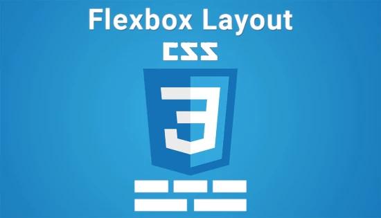
CSS flexbox layout is a CSS3 web layout model. It allows responsive elements within a container to be automatically arranged depending upon screen siz...
Read More →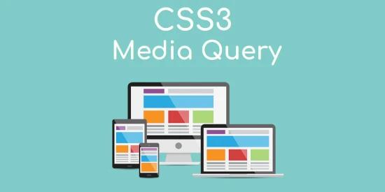
Today, Responsive web design has exploded in popularity. To create sites that work across numerous devices is on demand. But, the responsive design co...
Read More →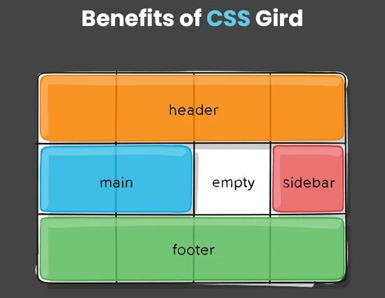
Over the past few years CSS grid systems have grown a lot in popularity. After landing in browser in early 2017, it quickly becoming considered best p...
Read More →
CSS (Cascading Style Sheets) came a long way in just a few years since its initial release in 1996. CSS3, the latest iteration of the style sheet lang...
Read More →
CSS stands for Cascading Style Sheets. It describes how HTML elements are to be displayed on the screen, paper, or in other media. It saves a lot of w...
Read More →
Nowadays a lot of people are using smartphones of different screen sizes so as to surf the internet. However, on screens of different sizes if we have...
Read More →